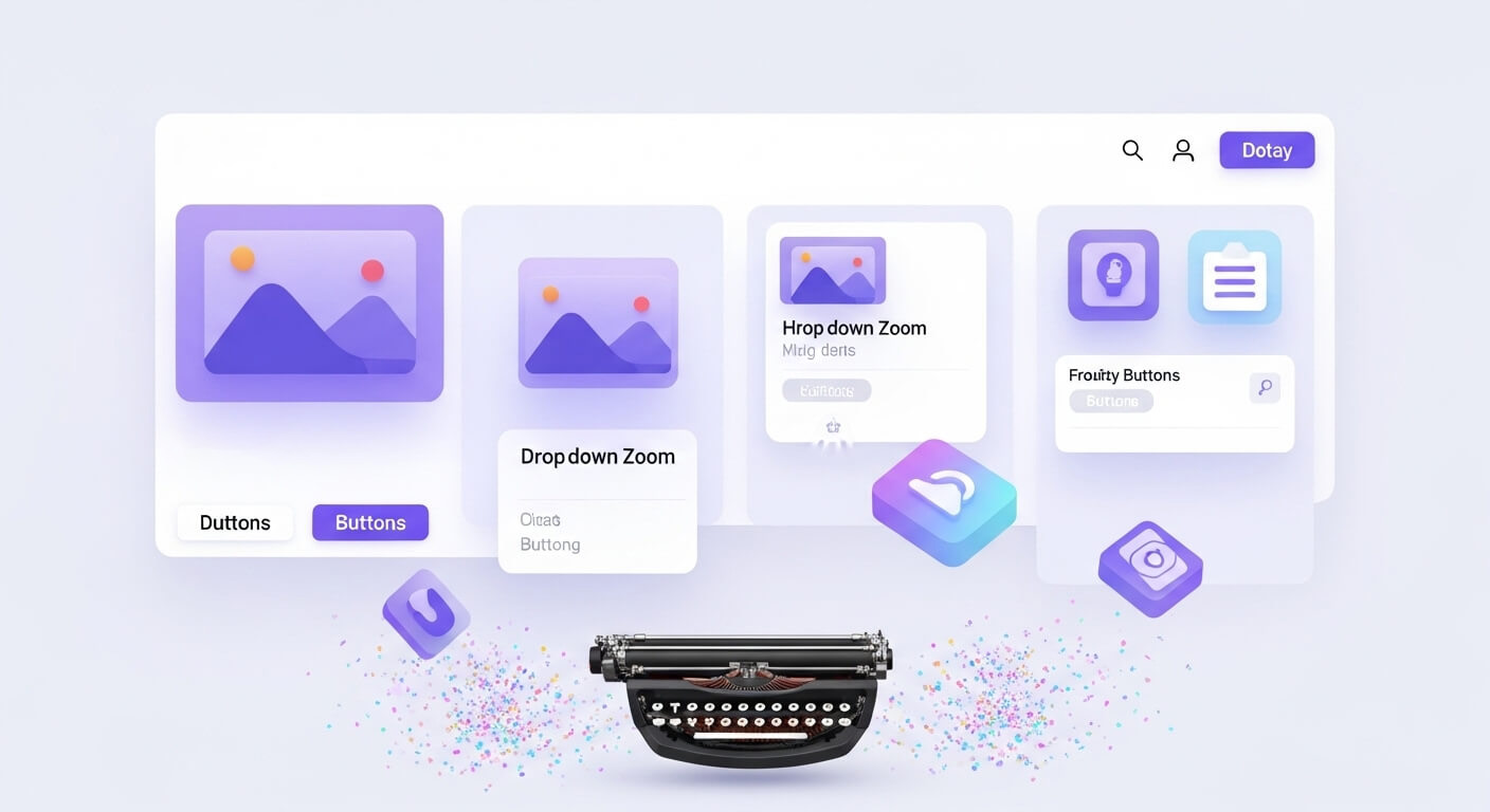
CSS has revolutionized the way developers create stunning web experiences — no JavaScript required. With modern capabilities, CSS animation has become a go-to technique for making websites dynamic, engaging, and interactive. From hover zoom effects to typewriter text, the right CSS animations can elevate a design and guide user interaction.
In this guide, we’ll dive into some of the top CSS animation techniques — including zoom, hover, and interactive effects — with live examples and code snippets. Whether you’re a beginner or a pro, you’ll find techniques that are useful, beautiful, and performance-friendly.
1. Zoom In and Zoom Out Animations in CSS
Zoom animations are popular for emphasizing content — such as enlarging images, cards, or buttons. There are several types of zoom effects, including css zoom out animation, zoom in zoom out animation css, and css image zoom on hover.
Zoom In Example
.zoom-in {
  transition: transform 0.3s ease;
}
.zoom-in:hover {
  transform: scale(1.2);
}Apply this class to any element like an image or a button to create a css image hover zoom effect. It’s particularly useful for css enlarge image on hover scenarios.
Zoom Out Example
.zoom-out {
  transform: scale(1.2);
  transition: transform 0.3s ease;
}
.zoom-out:hover {
  transform: scale(1);
}This creates a smooth css animation zoom out effect when a user hovers out of the image or element.
2. Image Hover Zoom Effect
A beautiful image hover zoom effect css draws attention without being disruptive.
<style>
.image-hover-zoom {
  overflow: hidden;
  display: inline-block;
}
.image-hover-zoom img {
  transition: transform 0.5s ease;
}
.image-hover-zoom:hover img {
  transform: scale(1.2);
}
</style>

<div class="image-hover-zoom">
  <img src="your-image.jpg" alt="Hover Zoom">
</div>Use this for product galleries, blog images, or portfolios.
3. Typewriter Effect in CSS
The typewriter effect css is perfect for hero headers or loading screens. This type writer effect css adds a retro vibe and improves visual storytelling.
<style>
@keyframes typing {
  from { width: 0 }
  to { width: 100% }
}

@keyframes blink {
  50% { border-color: transparent }
}

.typewriter {
  overflow: hidden;
  white-space: nowrap;
  border-right: 3px solid #000;
  width: 0;
  animation: typing 4s steps(40, end), blink 0.75s step-end infinite;
}
</style>

<h1 class="typewriter">Welcome to Modern CSS Animation</h1>This animation mimics the feel of a text being typed out.
4. Floating Button CSS
A floating button css adds utility and visibility. Floating buttons are often used for actions like scroll-to-top, support chat, or social sharing.
.floating-btn {
  position: fixed;
  bottom: 30px;
  right: 30px;
  background-color: #ff4081;
  color: white;
  border: none;
  padding: 15px;
  border-radius: 50%;
  font-size: 20px;
  cursor: pointer;
  box-shadow: 0 4px 8px rgba(0,0,0,0.2);
  transition: transform 0.3s;
}
.floating-btn:hover {
  transform: scale(1.1);
}This is a great example of float button css for UI interactions.
5. Animated Dropdown Menu CSS
Dropdowns don’t need to be boring. An animated dropdown menu css enhances navigation by making it more responsive and visually pleasant.
Simple Drop Down CSS Example
<style>
.dropdown {
  position: relative;
  display: inline-block;
}

.dropdown-content {
  display: none;
  position: absolute;
  background-color: white;
  min-width: 160px;
  box-shadow: 0 8px 16px rgba(0,0,0,0.2);
  z-index: 1;
  opacity: 0;
  transition: opacity 0.5s;
}

.dropdown:hover .dropdown-content {
  display: block;
  opacity: 1;
}
</style>

<div class="dropdown">
  <button>Menu</button>
  <div class="dropdown-content">
    <a href="#">Item 1</a><br>
    <a href="#">Item 2</a>
  </div>
</div>You can explore more creative versions on dropdown css codepen to level it up.
6. Confetti CSS Animation
Celebrating a user action? A confetti css animation adds delight.
@keyframes confetti-fall {
  0% { transform: translateY(0); }
  100% { transform: translateY(300px); }
}

.confetti {
  position: absolute;
  width: 10px;
  height: 10px;
  background: red;
  animation: confetti-fall 2s infinite;
}Add multiple .confetti divs with different colors, positions, and delays for a fun explosion.
7. Card Animation CSS
Interactive cards increase engagement. Use card animation css to animate on hover or on scroll.
.card {
  transition: transform 0.3s ease, box-shadow 0.3s ease;
}
.card:hover {
  transform: translateY(-10px);
  box-shadow: 0 10px 20px rgba(0,0,0,0.2);
}These work great in portfolio websites, product pages, and blog layouts.
8. Circle Animation CSS
To highlight loading states or background movement, try circle animation css.
@keyframes rotate-circle {
  0% { transform: rotate(0deg); }
  100% { transform: rotate(360deg); }
}

.circle {
  width: 50px;
  height: 50px;
  border: 5px solid #ccc;
  border-top: 5px solid #ff4081;
  border-radius: 50%;
  animation: rotate-circle 1s linear infinite;
}Use this as a custom spinner or visual accent.
9. Left to Right Animation CSS
Add motion to your layout using left to right animation css — great for text, banners, or icons.
@keyframes slideInLeft {
  0% {
    transform: translateX(-100%);
    opacity: 0;
  }
  100% {
    transform: translateX(0);
    opacity: 1;
  }
}

.slide-left {
  animation: slideInLeft 1s ease forwards;
}Trigger this on scroll using JavaScript or use it directly for static elements.
10. Useful CSS Generators and Extras
- CSS Ribbon: Add banners or labels using a css ribbon to indicate “New”, “Sale”, etc.
- CSS Triangle Generator: Need arrows or pointers? A css triangle generator helps create triangles using borders — no images required.
.triangle-up {
  width: 0;
  height: 0;
  border-left: 10px solid transparent;
  border-right: 10px solid transparent;
  border-bottom: 10px solid red;
}Final Thoughts
Mastering CSS animations is more than just aesthetics — it’s about enhancing user experience. With techniques like css zoom out animation, image hover zoom effect css, and animated dropdown menu css, you can guide user attention and make your interfaces memorable.
Whether you’re adding playful effects like confetti css animation or functional ones like floating button css, there’s a world of creativity waiting in CSS.
🤔 Frequently Asked Questions (FAQs)
How can I create a zoom in and zoom out effect in CSS?
Use the transform: scale() property and transition to animate scaling on hover. See the examples above.
What is the best way to enlarge an image on hover using CSS?
Wrap the image in a container and apply transform: scale(1.2) on hover with smooth transitions.
Can I make a typewriter effect without JavaScript?
Yes! You can use @keyframes to animate the width of a text container and simulate typing.
What tools can help with generating CSS shapes?
Use a css triangle generator to create arrows and indicators. Online tools provide ready-to-use code.
Are CSS animations good for performance?
Yes, if done correctly. Use GPU-accelerated properties like transform and opacity for best performance.
Leave a Reply