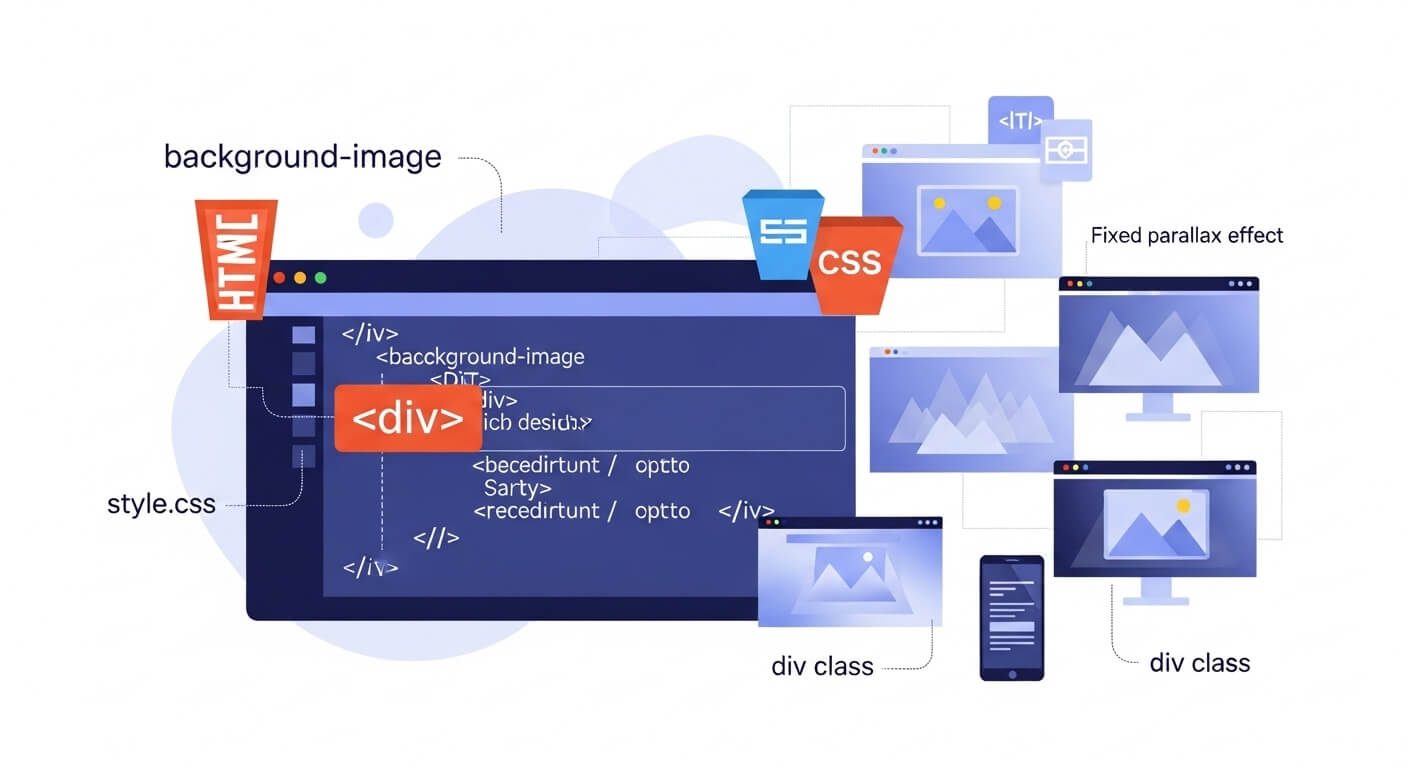
If you’re a beginner in web development, one of the first things you might wonder is how to add background image in HTML. Whether you’re building a personal blog or a business website, using background images can greatly enhance the visual appeal of your site.
In this guide, we’ll cover 7 easy and powerful methods to help you learn how to add background image in HTML using both inline CSS and external stylesheets. You’ll also find tips for best practices, responsive design, and links to useful tools and documentation.
You may also like: Is Flexbox Supported in All Browsers? 7 Crucial Facts You Must Know
What Is a Background Image in HTML?
A background image in HTML is an image placed behind the content of an HTML element. Unlike an <img> tag, which places an image inline with content, a background image is applied using CSS (Cascading Style Sheets).
Why Use Background Images?
Background images help:
- Improve visual aesthetics
- Support branding and user experience
- Create immersive layouts
- Add texture or design elements
How to Add Background Image in HTML: 7 Powerful Methods
Let’s explore how to add background image in HTML using different approaches.
Inline CSS Background (Basic Method)
<div style="background-image: url('image.jpg'); height: 400px; width: 100%;">
  <!-- Content here -->
</div>Best for quick testing or single-use blocks.
Using Internal CSS (Within <style> Tag)
<head>
  <style>
    .background {
      background-image: url('image.jpg');
      height: 400px;
    }
  </style>
</head>
<body>
  <div class="background"></div>
</body>Ideal for small projects with few styles.
Using External CSS File
/* styles.css */
.background {
  background-image: url('image.jpg');
  background-size: cover;
  height: 400px;
}<link rel="stylesheet" href="styles.css">
<div class="background"></div>Best practice for organized and scalable code.
Adding a Fixed Background Image
.fixed-bg {
  background-image: url('image.jpg');
  background-attachment: fixed;
  background-size: cover;
  height: 500px;
}Creates a parallax-like effect.
Using Background Image with Additional Properties
.enhanced-bg {
  background: url('image.jpg') no-repeat center center;
  background-size: cover;
}Offers full control over alignment and repeat behavior.
Responsive Background Image Using Media Queries
@media (max-width: 768px) {
  .responsive-bg {
    background-image: url('mobile-image.jpg');
  }
}Ensures your design looks great on all screen sizes.
Gradient Overlay on Background Image
.overlay-bg {
  background: linear-gradient(rgba(0,0,0,0.5), rgba(0,0,0,0.5)),
              url('image.jpg');
  background-size: cover;
  color: white;
}Improves text readability on image backgrounds.
Best Practices for Using Background Images
Optimize Image Size
- Compress images using tools like TinyPNG or ImageOptim.
Use CDN or Proper Image Paths
- Host images on a reliable CDN to improve load time.
Choose the Right File Format
- Use JPEG for photos and PNG/WebP for images needing transparency.
Use Fallback Colors
background-color: #f3f3f3;External Resources & Tools
Here are some valuable resources to help you dive deeper:
Conclusion
Now you know how to add background image in HTML using 7 different methods—from inline styles to fully responsive and optimized layouts. By using background images strategically, you can significantly improve the user experience and visual appeal of your website.
Remember:
- Use external CSS for scalability
- Compress images for speed
- Apply overlays for readability
Whether you’re building a portfolio or a product landing page, background images are your secret weapon for powerful, modern design.
Leave a Reply