Introduction
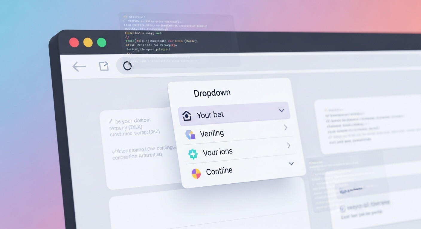
Dropdown menus are essential in modern web forms and UIs. Whether you’re building a country selector, a product filter, or a theme switcher and dropdown menu implementations are fundamental. In this in‑depth guide, you’ll learn how to create a dropdown menu in HTML, style it using CSS, enhance it with JavaScript, and optimize it for SEO.
By leveraging HTML select tag, HTML select option, and dropdown menu example snippets, you’ll gain full control over your dropdowns and take your UI/UX to the next level.
Understanding <select> and <option>
At the heart of any dropdown is the <select> element, inspired by traditional combo box HTML structures. Its children are <option> elements, each representing a selectable item. Here’s the bare minimum:
<label for="colorSelect">Choose a color:</label>
<select id="colorSelect" name="colors">
  <option value="red">Red</option>
  <option value="green" selected>Green</option>
  <option value="blue">Blue</option>
</select>This classic select tag creates a dropdown with select option values. Using the selected attribute highlights a default choice. It’s the foundation of every dropdown list in HTML.
Basic HTML Dropdown Menu Example
Let’s build a simple yet complete HTML dropdown menu form:
<form action="/submit" method="post">
  <label for="fruits">Select your favorite fruit:</label>
  <select id="fruits" name="fruit">
    <option value="">--Please choose an option--</option>
    <option value="apple">Apple</option>
    <option value="banana">Banana</option>
    <option value="cherry">Cherry</option>
    <option value="date">Date</option>
  </select>
  <button type="submit">Submit</button>
</form>This dropdown menu example shows a default placeholder: --Please choose an option--. A small but powerful touch when guiding users.
Styling the Dropdown with CSS
W3Schools covers basic dropdown styling, but here’s how to customize your select dropdown:
select {
  padding: 8px 12px;
  border: 1px solid #ccc;
  border-radius: 4px;
  font-size: 16px;
  appearance: none;
  background: url('arrow-down.svg') no-repeat right center;
  background-size: 12px;
}This CSS makes your dropdown look clean and modern. You can wrap the <select> inside a .dropdown-wrapper with position: relative to add a custom arrow.
Advanced Custom Dropdown Designs
For a custom dropdown menu HTML example, developers often hide the native <select> and reconstruct the UI with <div>s and JavaScript:
<div class="custom-select">
  <div class="selected">Select option</div>
  <div class="options">
    <div data-value="1">Option One</div>
    <div data-value="2">Option Two</div>
    <div data-value="3">Option Three</div>
  </div>
</div>
And the JavaScript logic:
const customSelect = document.querySelector('.custom-select');
const selected = customSelect.querySelector('.selected');
const optionsContainer = customSelect.querySelector('.options');

selected.addEventListener('click', () => {
  optionsContainer.classList.toggle('active');
});

optionsContainer.querySelectorAll('div').forEach(optionDiv => {
  optionDiv.addEventListener('click', () => {
    selected.textContent = optionDiv.textContent;
    selected.dataset.value = optionDiv.dataset.value;
    optionsContainer.classList.remove('active');
    console.log('Selected value:', selected.dataset.value);
  });
});
This select dropdown recreation supports deep customization—transitioning beyond W3Schools dropdown basics.
JavaScript for Interactive Dropdowns
To select an option in dropdown using JavaScript:
const mySelect = document.getElementById('mySelect');
mySelect.value = 'banana'; // auto-selectOr react when a user changes the selection:
mySelect.addEventListener('change', (e) => {
  console.log('User picked:', e.target.value);
  // e.g., dynamically update content based on selection
});JavaScript integration transforms standard form elements into powerful interactive tools.
Dropdown Accessibility Best Practices
A fully accessible select tag setup involves:
- Labeling: Always use
<label for="…">. - Keyboard navigation: Native
<select>supports this out of the box. - For custom dropdowns:
- Use
role="listbox"androle="option". - Manage
tabindex,aria-expanded,aria-selected. - Listen to
keydownevents for arrow keys and enter.
- Use
Tools like Axe or Lighthouse can assess your dropdowns for screen reader compatibility.
Common Use‑Cases in Web Forms
Dropdowns in real‑world scenarios include:
- Country selectors:
<select name="country" id="country">
  <option value="">– Country –</option>
  <option value="us">United States</option>
  <option value="ca">Canada</option>
  <!-- etc. -->
</select>Theme switchers:
<select id="themeSwitcher">
  <option value="light">Light</option>
  <option value="dark">Dark</option>
</select>
Form filters (price, size, category…):
<label for="size">Select size:</label>
<select id="size" name="size">
  <option value="">--Size--</option>
  <option value="s">Small</option>
  <option value="m">Medium</option>
  <option value="l">Large</option>
</select>
Each scenario relies on robust dropdown constructs like dropdown menu example above.
SEO Optimization with Dropdown Elements
While dropdowns are interactive UI elements (not directly ranking signals), they influence user experience metrics like dwell time and bounce rate. Here’s how your select dropdown HTML can support SEO:
- Use descriptive option values (e.g.,
value="lapel-jacket"). - Include a placeholder option to guide clarity:
<option value="">Select category</option>. - Use schema markup if dropdowns are used for structured data (e.g. event selectors).
- Avoid hiding essential navigational links behind JS‑only dropdowns.
- Ensure fast loading of any dropdown menu examples—minimize CSS/JS.
As Google emphasizes UX signals, well‑implemented dropdowns are part of a polished, crawl‑friendly site.
FAQs
What is the difference between dropdown menu and select dropdown?
A dropdown menu is a general UI term that can be custom‑styled or JS‑powered. A select dropdown refers specifically to the native <select> HTML element with <option> children.
How to style the select tag?
Use CSS properties: padding, border, border-radius, appearance: none, and background images to hide the default arrow. You can find w3schools dropdown menu examples demonstrating basics.
How do you make a dropdown accessible?
Ensure semantic HTML (<label>, <select>), keyboard support, proper ARIA roles (role="listbox"), and screen reader compatibility.
Should I use native select or custom dropdown?
For basic forms, select tag is ideal for accessibility and performance. Use custom dropdown only when additional styling or functionality justifies the extra JS/ARIA work.
Are dropdowns good for SEO?
They don’t directly improve ranking but enhance user experience—friendly navigation, engagement, and lower bounce—supporting SEO indirectly.
Leave a Reply