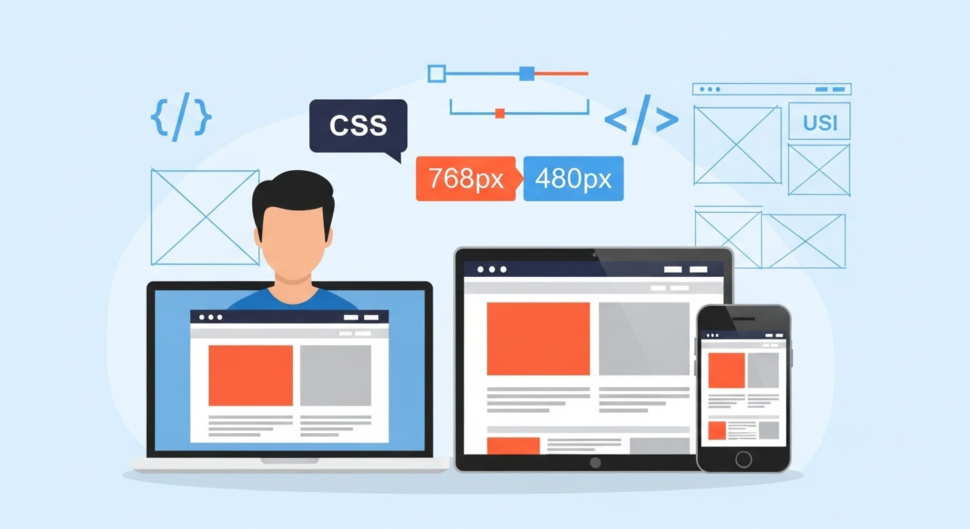
When designing responsive websites, knowing how to use a CSS media query to hide something at large screen sizes can be incredibly useful. Whether you’re working with navigation menus, banners, or promotional content, controlling visibility across screen widths is key to great UX.
In this article, we’ll cover how to implement this technique, when it’s most effective, and why every frontend developer should master it.
You might like: HTML Meta Tag Redirect: 7 Powerful Ways for Seamless Redirection
Why You Need a CSS Media Query to Hide Something at Large Screen Sizes
Using a CSS media query to hide something at large screen sizes isn’t just about hiding elements—it’s about optimizing the layout for users on desktops and large monitors. Elements that are useful on smaller screens, like mobile call-to-action buttons or hamburger menus, can clutter the desktop experience.
Hiding these elements conditionally helps:
- Clean up the interface
- Improve readability
- Enhance overall UX
- Increase conversion rates
How to Use CSS Media Query to Hide Something at Large Screen Sizes
Here’s a quick snippet of how you can do it:
@media (min-width: 1024px) {
  .hide-on-large {
    display: none;
  }
}Explanation:
This CSS media query to hide something at large screen sizes activates when the viewport is 1024px or wider. Any element with the class .hide-on-large will be hidden on large screens.
7 Effective Use Cases for This CSS Technique
Hiding Mobile Navigation on Desktop
Your mobile menu might look odd on a 1440px screen. Hide it using this media query and show your full navigation bar instead.
Removing Floating CTA Buttons
Floating call-to-action buttons are great on mobile. On desktop, they can interfere with readability.
Suppressing Mobile-Specific Promos
Promos meant for mobile users (like app downloads) might not be relevant on desktops.
Hiding Chat Widgets
Some chat pop-ups might be better suited for mobile users who need more assistance.
Disabling Touch-Based Elements
Swipe areas, touch carousels, or gesture-based content don’t make sense on desktops.
Managing Ads
Sometimes desktop ads are served differently. Hide mobile-specific ad units when the screen is large.
Optimizing Performance
Hiding less-important content can reduce render time and improve site speed on larger displays.
Best Practices for Using CSS Media Query to Hide Something at Large Screen Sizes
Use min-width for large screen targeting
Using min-width ensures styles are applied only at or above the defined screen width.
Keep class names semantic
Instead of .hide-on-large, use meaningful names like .mobile-cta or .mobile-banner.
Avoid overusing hidden elements
Too many hidden elements may still load in the DOM and affect performance.
Combine with JavaScript for dynamic control
Sometimes it’s beneficial to use JavaScript along with CSS media queries to hide and show elements more intelligently.
CSS Media Query to Hide Something at Large Screen Sizes in Frameworks
Many CSS frameworks include built-in utilities for this:
Tailwind CSS:
<div class="lg:hidden">This hides on large screens</div>Bootstrap 5:
<div class="d-lg-none">This also hides on large screens</div>These utility classes are shorthand implementations of the CSS media query to hide something at large screen sizes, making responsive design quicker and cleaner.
Accessibility Considerations
Using display: none can make elements completely inaccessible to screen readers. If you’re hiding interactive content, consider whether it’s necessary and how it affects all users.
Learn more from WebAIM’s guide on accessibility and visibility.
Helpful Tools & Resources
- MDN Web Docs: Using Media Queries
- CSS Tricks: Complete Guide to Media Queries
- Can I use Media Queries?
Final Thoughts on Using CSS Media Query to Hide Something at Large Screen Sizes
Using a CSS media query to hide something at large screen sizes is a small but powerful tool in your responsive design arsenal. Whether you’re improving UX, reducing clutter, or streamlining your layout for different devices, this technique gives you control and flexibility.
Want your design to shine across all screen sizes? Then master the art of media queries—and don’t forget to hide what’s unnecessary.
Leave a Reply