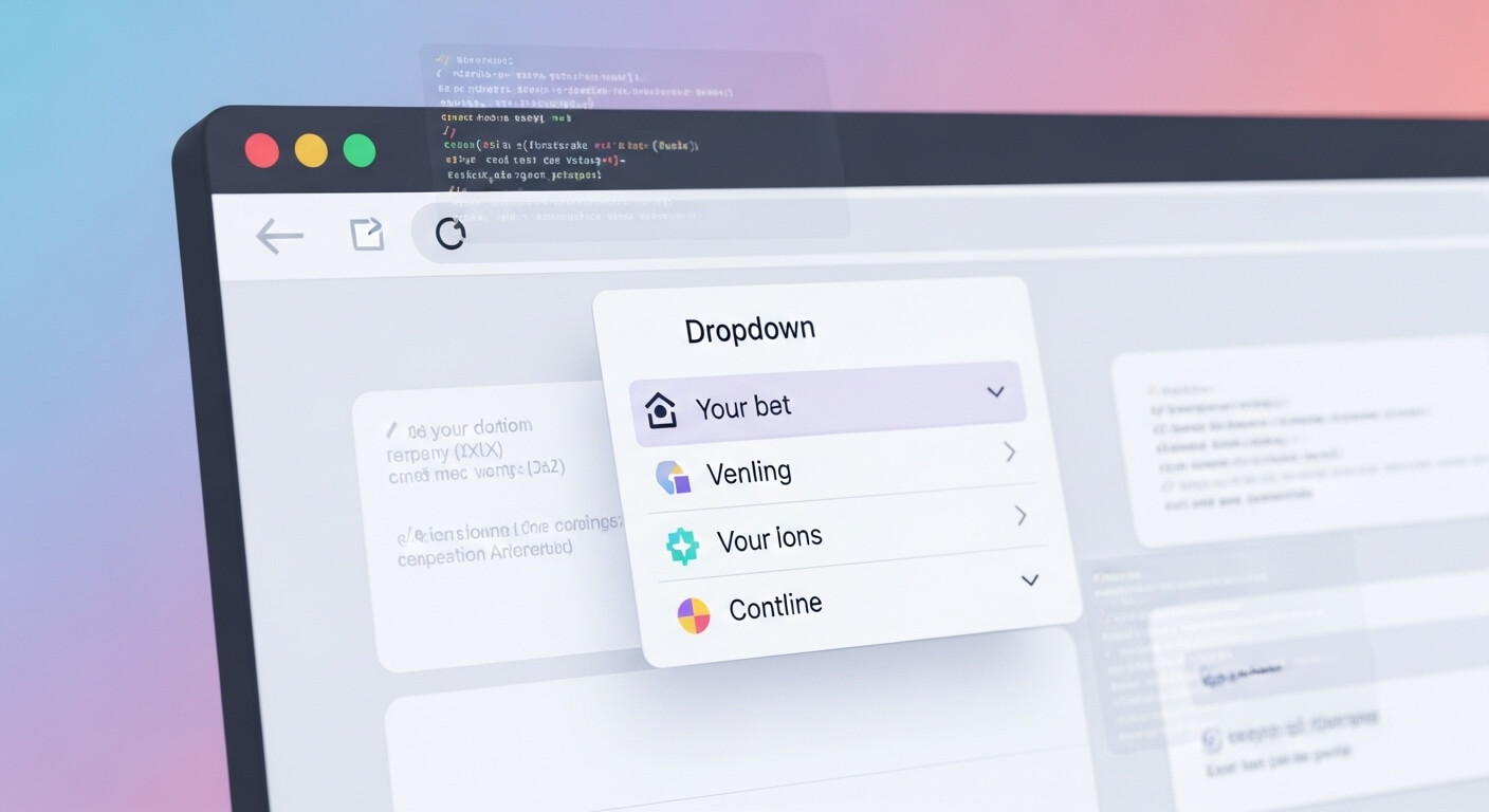
When building modern websites, one of the most common and crucial UI components is the dropdown menu. But making it look perfect — especially getting it to overlay properly — can be tricky. In this guide, we’ll walk you through how to overlay dropdown menu in CSS the right way.
Overlaying dropdown menus allows for better usability and cleaner designs. Whether you’re building a navigation bar or an interactive settings panel, getting this right is essential. Let’s dive into it.
Read also: CSS Set Width Based on Screen Resolution: 7 Powerful Tips
Why Learn How to Overlay Dropdown Menu in CSS?
Understanding how to overlay dropdown menu in CSS is key to creating responsive, user-friendly interfaces. Improperly rendered menus often look broken or hide behind other elements — leading to a frustrating user experience.
Using CSS, you can control layout, layering, transitions, and interactions without relying heavily on JavaScript. This makes your web pages faster and more maintainable.
Understand the Basics of Positioning in CSS
To overlay elements in CSS, you first need to understand the different positioning methods:
- Static: Default position (no overlay).
- Relative: Positioned relative to itself.
- Absolute: Positioned relative to the nearest positioned ancestor.
- Fixed: Positioned relative to the viewport.
- Sticky: Sticks in place based on scroll.
To overlay a dropdown, you typically combine relative and absolute positioning.
.nav-item {
  position: relative;
}

.dropdown-menu {
  position: absolute;
  top: 100%;
  left: 0;
  z-index: 1000;
}In this setup, the .dropdown-menu will appear directly below .nav-item and stack on top of other content.
Z-Index: The Secret to Perfect Overlay
One common mistake when learning how to overlay dropdown menu in CSS is forgetting about the z-index property.
The z-index determines the stack order of elements. A higher z-index will place the element on top of others.
.dropdown-menu {
  z-index: 999;
}Make sure that parent containers don’t have lower z-index values that interfere with the dropdown display.
Useful Resource: MDN Web Docs – z-index
Display Properties: Block, Inline-Block, or Flex?
Another vital tip for mastering how to overlay dropdown menu in CSS is managing the display type.
For the dropdown to show or hide correctly, use:
.dropdown-menu {
  display: none;
  position: absolute;
}

.nav-item:hover .dropdown-menu {
  display: block;
}Alternatively, for smoother animations or complex layouts, consider using flex or grid.
Add Smooth Transitions for Better UX
Adding transitions creates a more polished and interactive experience.
.dropdown-menu {
  opacity: 0;
  visibility: hidden;
  transition: opacity 0.3s ease;
}

.nav-item:hover .dropdown-menu {
  opacity: 1;
  visibility: visible;
}This technique improves accessibility and helps users better understand menu behavior.
Handling Scroll and Overflow
Dropdowns that overlay but are cut off or hidden often suffer from bad overflow settings.
Make sure to check the parent containers:
.container {
  overflow: visible;
}Avoid overflow: hidden; unless absolutely necessary, as it may clip your dropdown.
Make It Responsive
Responsive dropdown menus should work on all screen sizes. When exploring how to overlay dropdown menu in CSS, don’t forget media queries.
@media (max-width: 768px) {
  .dropdown-menu {
    position: static;
    display: block;
  }
}You can also toggle visibility via JavaScript or a CSS checkbox hack for mobile views.
Advanced Technique: Using CSS Grid or Flexbox
If you want pixel-perfect alignment, try combining absolute with flexbox:
.navbar {
  display: flex;
  justify-content: space-between;
}

.dropdown-menu {
  position: absolute;
  display: flex;
  flex-direction: column;
}Flexbox gives you more control over the spacing and direction of dropdown items.
Common Mistakes When Overlaying Dropdowns
Here are a few pitfalls to avoid:
- Forgetting to set
position: relativeon the parent. - Using
z-indexwithout positioning. - Not testing on multiple screen sizes.
- Clipping dropdowns with
overflow: hidden.
Best Practices
- Always test in multiple browsers (Chrome, Safari, Firefox).
- Use semantic HTML for better accessibility.
- Avoid inline styles — stick to CSS classes.
- Keep code modular and reusable.
Conclusion
Mastering how to overlay dropdown menu in CSS isn’t just a small trick — it’s a vital part of front-end development. When done right, it enhances user experience and adds polish to your interface.
By using positioning, z-index, responsive design, and modern CSS properties, you can ensure your dropdown menus appear exactly where and how you want them.
Leave a Reply