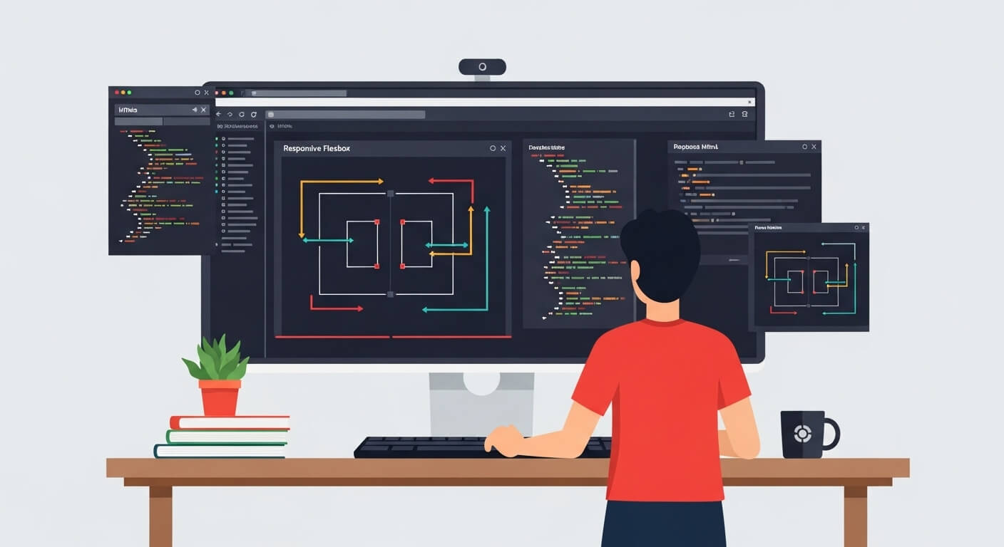
In the fast-paced world of web development, mastering modern layout systems is essential. One of the most powerful layout modules in CSS is Flexbox, introduced to simplify responsive design. Whether you’re a beginner or an experienced developer, understanding how to use display: flex will enhance your ability to build dynamic, efficient, and elegant web interfaces.
In this complete guide, we’ll explore everything you need to know about CSS Flexbox—from syntax to real-world flexbox layout examples, and how it differs from CSS Grid. We’ll also cover key concepts like alignment, direction, and responsiveness using flex properties.
What is Flexbox in CSS?
Flexbox, short for Flexible Box Layout, is a one-dimensional layout model in CSS used to arrange items in rows or columns. Unlike traditional layout methods like floats or positioning, display: flex offers easier alignment and distribution of space among items in a container—even when their size is unknown.
.container {
  display: flex;
}Once you add display: flex to a parent container, its direct children become flex items, and you gain access to powerful layout features.
Why Use display: flex in Web Development?
Benefits of CSS Flexbox:
- Simplifies alignment (horizontal & vertical)
- Handles dynamic content sizes
- Enables mobile-first, responsive flexbox layout
- Works well with both fixed and fluid elements
- Eliminates need for float hacks or clearfix
In essence, Flexbox helps you build responsive UIs more intuitively than legacy layout techniques.
Understanding Flexbox Terminology
Before diving into examples, it’s crucial to grasp Flexbox’s core concepts:
Flex Container
The parent element with display: flex.
.parent {
  display: flex;
}Flex Items
The children of the flex container.
<div class="parent">
  <div class="item">1</div>
  <div class="item">2</div>
</div>Basic Flexbox Properties
1. Flex Direction
Controls the main axis: horizontal (row) or vertical (column).
.container {
  flex-direction: row; /* default */
}Options:
rowrow-reversecolumncolumn-reverse
2. Justify Content
Aligns items along the main axis (left to right by default).
.container {
  justify-content: space-between;
}Options include:
flex-startflex-endcenterspace-betweenspace-aroundspace-evenly
3. Align Items
Aligns items along the cross axis (vertical if row is the direction).
.container {
  align-items: center;
}4. Flex Wrap
Determines whether items should wrap to the next line if they overflow.
.container {
  flex-wrap: wrap;
}Real-World Flexbox Layout Examples
Here’s a responsive flexbox layout example that centers three boxes:
<div class="flex-container">
  <div class="box">Box 1</div>
  <div class="box">Box 2</div>
  <div class="box">Box 3</div>
</div>.flex-container {
display: flex;
justify-content: center;
align-items: center;
gap: 20px;
height: 100vh;
}
.box {
background-color: #4caf50;
color: white;
padding: 20px;
width: 100px;
text-align: center;
}This simple layout is a practical flex example for horizontal alignment and responsiveness.
Flexbox Grid: Combining Flex and Grid in CSS
While Flexbox is best for one-dimensional layouts, CSS Grid excels at two-dimensional layouts. However, combining both offers powerful layout capabilities.
For instance:
.wrapper {
  display: grid;
  grid-template-columns: 1fr 2fr;
}

.flex-content {
  display: flex;
  flex-direction: column;
  gap: 10px;
}This hybrid approach blends flex grid behavior—using Flexbox within Grid for better control.
Common Flexbox Layout Patterns
Centering Content
.container {
  display: flex;
  justify-content: center;
  align-items: center;
  height: 100vh;
}Sidebar + Content
.layout {
  display: flex;
}

.sidebar {
  width: 250px;
}

.main {
  flex-grow: 1;
}These CSS tricks with flexbox save time while ensuring clean layout logic.
Nested Flexbox Layouts
Flexbox can also be nested for complex UIs:
<div class="outer">
  <div class="inner">
    <div>Item A</div>
    <div>Item B</div>
  </div>
</div>.outer {
display: flex;
justify-content: center;
}
.inner {
display: flex;
flex-direction: column;
}Nested flexbox container and items structure enables flexible, component-based design systems.
Responsive Design with Flexbox
Creating a responsive flexbox layout means using flex-wrap, media queries, and relative sizing.
@media (max-width: 768px) {
  .flex-container {
    flex-direction: column;
  }
}Responsiveness is one of the biggest reasons developers adopt Flexbox over traditional CSS techniques.
Flexbox vs Grid: When to Use Each?
| Feature | Flexbox | CSS Grid |
|---|---|---|
| Layout Direction | 1D (row or column) | 2D (rows and columns) |
| Content Flow | Good for dynamic content | Good for known layout structure |
| Use Case | Navigation bars, cards, toolbars | Web page sections, dashboards |
Flexbox vs Grid CSS isn’t about which is better—but which is more appropriate for a specific scenario.
Flexbox Positioning: How to Align Items Properly
If you’re wondering about flex position, here’s a breakdown:
- Use
justify-contentfor horizontal alignment - Use
align-itemsfor vertical alignment - Use
align-selfto override alignment on individual items
.item {
  align-self: flex-end;
}This provides per-item control within a flexbox layout.
Final Thoughts on CSS Flexbox
CSS Flexbox is a powerful and elegant way to structure responsive layouts without relying on floats or outdated layout methods. With its intuitive syntax, nested flexbox layouts, and powerful alignment properties, display: flex is now a fundamental skill in modern web development.
Whether you’re creating a navigation bar, responsive card layout, or a sidebar-content split, Flexbox offers clarity, flexibility, and efficiency.
To maximize Flexbox’s power, practice with real-world flexbox layout examples, explore flexbox container and items structures, and understand how it fits into the broader landscape alongside CSS Grid.
FAQs
What does display: flex do in CSS?
display: flex turns a container into a flex container, enabling its children (flex items) to align and distribute dynamically using Flexbox properties.
What is the difference between flex and inline-flex?
flex creates a block-level container.inline-flex creates an inline-level flex container.
Both provide the same flex behavior, but affect surrounding content differently.
How do I center content using Flexbox?
Use the following:
display: flex;
justify-content: center;
align-items: center;
This centers both horizontally and vertically.
Can I use Flexbox inside a Grid layout?
Yes. You can nest flexbox inside grid items for greater layout flexibility.
Which is better: Flexbox or Grid?
It depends on the layout need:
Use Flexbox for 1D layouts (rows or columns)
Use Grid for 2D layouts (rows and columns)


Leave a Reply