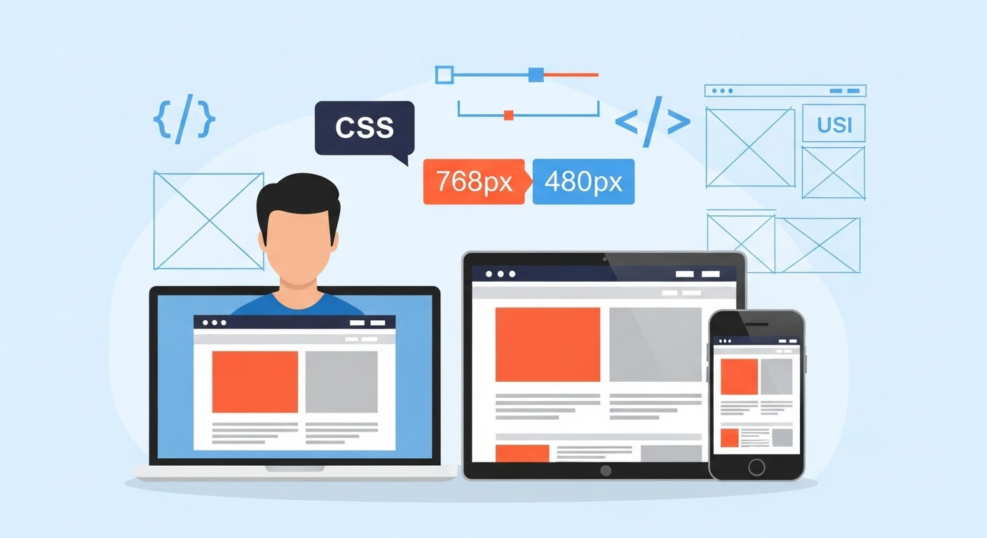
In today’s mobile-first world, designing websites that adapt seamlessly to various screen sizes is not just a trend—it’s a necessity. Whether you’re building a simple blog or a complex web app, CSS media queries are essential tools in a developer’s toolkit. They allow us to apply different styles depending on device characteristics like screen width, height, orientation, and resolution.
This comprehensive guide covers everything you need to know about media queries, from basic syntax to responsive design patterns for mobile, desktop, and beyond.
What Is a Media Query in CSS?
A media query is a feature of CSS3 that lets you apply styles conditionally based on a device’s general type (such as print vs. screen) and specific characteristics (such as screen width, resolution, or orientation).
Basic Syntax:
@media media-type and (condition) {
  /* CSS rules here */
}Example:
@media screen and (max-width: 768px) {
  body {
    background-color: lightblue;
  }
}In this example, the background color will only change to light blue if the screen’s width is 768 pixels or less.
CSS Media Queries for Mobile Devices
Creating a responsive mobile view is crucial because the majority of web traffic comes from mobile devices. Here’s a common media query for mobile devices:
@media only screen and (max-width: 480px) {
  .container {
    padding: 10px;
    font-size: 14px;
  }
}This ensures smaller text and less padding, improving readability and performance on smaller screens.
Popular breakpoints for mobile:
- Extra small (phones):
max-width: 480px - Small (phablets):
max-width: 600px
Media Queries for Desktop Screens
Designing for large screens is just as important. A media query for desktop usually targets widths over 1024px:
@media screen and (min-width: 1025px) {
  .container {
    max-width: 1200px;
    margin: auto;
  }
}This ensures that content stays centered and doesn’t stretch too wide on large displays.
Responsive Media Queries for All Devices
Using multiple breakpoints allows you to create responsive media queries for all devices:
/* Phones */
@media only screen and (max-width: 480px) { ... }

/* Tablets */
@media only screen and (min-width: 481px) and (max-width: 768px) { ... }

/* Desktops */
@media only screen and (min-width: 769px) and (max-width: 1024px) { ... }

/* Large Screens */
@media only screen and (min-width: 1025px) { ... }This responsive CSS for all devices ensures your layout adjusts based on user screen size.
Understanding Media Query Syntax
Let’s break down the media query syntax with a practical example:
@media screen and (max-width: 768px) {
  nav {
    display: none;
  }
}@media: Starts the media query.screen: Targets screen-based devices (not print).(max-width: 768px): Applies the rules if the screen is 768 pixels wide or smaller.
You can combine multiple conditions using logical operators:
@media screen and (min-width: 600px) and (max-width: 900px) {
  .sidebar {
    display: none;
  }
}Responsive Design Best Practices
To get the most from your responsive media queries, follow these tips:
- Start Mobile-First:
Define base styles for small devices, then layer styles for larger screens usingmin-width. - Use Relative Units:
Instead ofpx, useem,rem, or%for more flexible design. - Keep Breakpoints Logical:
Use breakpoints at natural content breakpoints—not just device sizes. - Test on Real Devices:
Simulators help, but real-device testing ensures cross-browser compatibility.
Media Query Examples (With Code)
Example 1: Hiding Elements on Mobile
@media only screen and (max-width: 600px) {
  .desktop-only {
    display: none;
  }
}Example 2: Responsive Grid Layout
.grid {
  display: grid;
  grid-template-columns: 1fr 1fr 1fr;
}

@media (max-width: 768px) {
  .grid {
    grid-template-columns: 1fr;
  }
}Example 3: Adjust Font Size by Screen Width
@media screen and (max-width: 480px) {
  body {
    font-size: 14px;
  }
}
@media screen and (min-width: 481px) and (max-width: 768px) {
  body {
    font-size: 16px;
  }
}
@media screen and (min-width: 769px) {
  body {
    font-size: 18px;
  }
}Media Queries and Frameworks (Tailwind, Bootstrap)
Tailwind CSS Media Queries
Tailwind uses utility-first classes based on breakpoints:
<div class="text-base md:text-lg lg:text-xl">Responsive Text</div>Bootstrap Media Query Breakpoints
Bootstrap includes default breakpoints for:
sm: 576pxmd: 768pxlg: 992pxxl: 1200pxxxl: 1400px
You can also customize media queries in Bootstrap with utility classes like d-none d-md-block.
Latest Mobile Media Query Trends (2025)
New mobile media usage is evolving with device features like foldable screens and smart TVs. Consider:
@media (orientation: portrait) { ... }@media (hover: none) and (pointer: coarse) { ... }— Targets touch devices
High-resolution support:
@media (-webkit-min-device-pixel-ratio: 2), (min-resolution: 192dpi) {
  img {
    width: 100%;
    height: auto;
  }
}Educational Resources
Media query W3Schools pages are a good starting point, but advanced developers should combine this with MDN Web Docs and CSS Tricks.
Visit:
Final Thoughts
Media queries are the backbone of responsive web design. Whether you’re crafting a minimalist blog or an enterprise-grade application, understanding how to use media queries allows you to build seamless user experiences across all devices. From defining your breakpoints to applying CSS conditionally, mastering this feature of CSS is a must for every web developer in 2025 and beyond.
FAQ: CSS Media Queries
What are the best CSS breakpoints for responsive design?
It depends on your design, but common breakpoints are:
480px for mobile phones
768px for tablets
1024px for small desktops
1200px+ for large screens
What is @media screen and (max-width: 768px) used for?
This media screen and max-width 768px query targets tablets and smaller screens. It’s widely used to switch to a mobile-friendly layout.
Can I use media queries for screen orientation?
Yes! Use:
@media screen and (orientation: portrait) {
/* Styles for portrait mode */
}
What is the difference between min-width and max-width?
min-width: Styles apply when screen is at least X pixels wide (good for mobile-first).max-width: Styles apply when screen is up to X pixels wide (good for desktop-first).
Why are my media queries not working?
Check if they are overridden by other styles.
Make sure you’re using correct viewport <meta> tag:
<meta name=”viewport” content=”width=device-width, initial-scale=1.0″>
Leave a Reply