If you’ve ever asked yourself, “Should the entire website be built with Flexbox?”, you’re not alone. Many front-end developers, especially beginners, consider using Flexbox as a one-size-fits-all layout tool because of its ease and versatility.
But while Flexbox is undoubtedly powerful, relying entirely on it for every part of a website might not be the smartest or most scalable choice. In this article, we’ll explore why, when, and how to use Flexbox effectively—and when you shouldn’t.
You may also like: CSS Set Width Based on Screen Resolution: 7 Powerful Tips
What Is Flexbox, and Why Is It So Popular?
Flexbox (Flexible Box Layout) is a CSS layout module designed to simplify aligning and distributing space among items in a container. It’s particularly useful for designing responsive components and aligning items vertically and horizontally without complex hacks.
Key features include:
- One-dimensional layout (either row or column)
- Control over alignment, spacing, and order
- Dynamic resizing of children elements
- Better responsiveness compared to floats or inline-blocks
Flexbox has become a developer favorite due to its intuitive syntax and browser support. MDN Web Docs offers a deep dive into its capabilities.
Should the Entire Website Be Built With Flexbox? The Short Answer: No
Although it’s tempting to use Flexbox for everything, the real-world answer to “should the entire website be built with Flexbox?” is a resounding no—and here’s why.
When Flexbox Is the Right Tool
Flexbox excels at:
- Navigation bars
- Card layouts
- Toolbars
- Small UI components
- Aligning content vertically and horizontally
If you need to center a login form or create a row of buttons with consistent spacing, Flexbox is perfect.
Why You Shouldn’t Use Flexbox for Entire Website Layouts
Let’s break down the limitations and why Flexbox isn’t always the best choice for entire website structures.
Flexbox is One-Dimensional
Unlike CSS Grid, Flexbox works along a single axis—either horizontally or vertically. This means that for complex two-dimensional layouts, like dashboards or blog grids, Flexbox becomes clunky and overly nested.
Over-Nesting Gets Messy
To achieve multi-dimensional layouts, you’ll need to nest multiple Flexbox containers. This leads to bloated code, poor maintainability, and potential accessibility issues.
Poor Scalability for Responsive Designs
While Flexbox is responsive, managing complex breakpoints and layout changes can be harder compared to CSS Grid or utility-first frameworks like Tailwind CSS.
Performance and Readability
Too many nested Flex containers can confuse both the browser rendering engine and your fellow developers. Using Flexbox exclusively may cause unnecessary DOM complexity.
CSS Grid Offers Better Alternatives
CSS Grid allows two-dimensional layout designs, making it more suitable for larger sections of the page like hero banners, content grids, and footers.
See this CSS Grid vs Flexbox comparison on CSS-Tricks for a clearer picture.
Best Practices: Combine Flexbox With Other Layout Systems
So, should the entire website be built with Flexbox? No—but that doesn’t mean you shouldn’t use it strategically. The most professional and scalable approach is to combine layout tools based on use cases:
- Use Flexbox for UI components and linear structures
- Use CSS Grid for overarching page layouts
- Use media queries or modern frameworks for responsiveness
This approach maximizes flexibility, performance, and maintainability.
Real-World Use Cases (Do This, Not That)
| Component | Use Flexbox? | Recommended Alternative |
|---|---|---|
| Navbar with links | Yes | Flexbox is ideal here |
| Multi-column blog grid | No | Use CSS Grid |
| Footer with 3 columns | Maybe | Prefer Grid for equal spacing |
| Modal dialogs | Yes | Flexbox centers content beautifully |
| Entire page layout | No | Grid or container-based frameworks |
SEO and Accessibility Considerations
While layout tools like Flexbox don’t directly affect SEO, poor layout choices can lead to bloated HTML, confusing content structure, and hindered accessibility. Tools like WAVE can help identify such issues early.
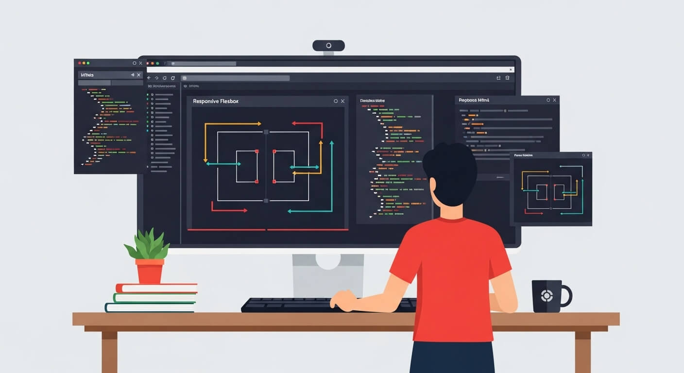
Top Tools to Visualize and Test Layouts
These tools help you experiment and understand when Flexbox is appropriate.
Conclusion: Should the Entire Website Be Built With Flexbox? Use It Wisely
To wrap up: Should the entire website be built with Flexbox? Definitely not. While Flexbox is incredibly useful for many UI components and layout tasks, it isn’t the best option for full-page layout design. Overusing it can lead to performance bottlenecks, scalability issues, and tangled code.
Instead, adopt a hybrid layout strategy—combining Flexbox with Grid and modern CSS practices to get the best of all worlds. This approach leads to cleaner, faster, and more maintainable websites.
Leave a Reply